Vinyl Siding Color Palettes: A Complete Guide to Modern Exterior Trends
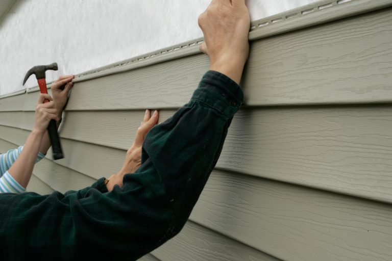
Selecting a new exterior for your home is an investment that transcends simple protection from the elements. It is an opportunity to redefine the architectural identity of your residence through deliberate aesthetic choices. When homeowners begin a renovation project, they often discover that modern Vinyl siding color palettes offer a staggering variety of hues that were once only available in high-end wood or masonry. This evolution in manufacturing has turned the exterior of the home into a canvas for personal expression and neighborhood prestige.
The journey toward the perfect exterior begins with understanding how color interacts with light, shadow, and structure. Consequently, the decision-making process should not be rushed or based solely on current fads. Instead, it requires a strategic analysis of long-term trends and the specific environmental context of the property. By examining how different tones harmonize with the surrounding landscape, a homeowner can ensure their property remains timeless rather than dated.

Furthermore, the technical side of exterior design has improved significantly over the last decade. Historically, dark colors were prone to fading and warping under intense UV exposure. However, modern acrylic formulations and heat-reflective pigments have expanded the available Vinyl siding color palettes to include deep charcoals, forest greens, and rich navies. These darker options provide a level of sophistication and “curb appeal” that can significantly increase the market value of a home during a resale event.
The Evolution of Exterior Architectural Aesthetics
In the mid-20th century, vinyl siding was often criticized for its limited range of options. Homeowners were generally restricted to a handful of “safe” pastels, such as beige, pale yellow, and off-white. This limitation was due to the chemical makeup of early PVC materials, which could not maintain the integrity of dark pigments over time. As a result, many suburban neighborhoods developed a uniform, somewhat sterile appearance that lacked individuality.
Technological breakthroughs in the 1990s and early 2000s changed this trajectory forever. Chemists developed stabilizers that protect the vinyl matrix from the degrading effects of ultraviolet radiation. This innovation allowed manufacturers to experiment with saturated tones without the fear of “chalking” or uneven fading. Today, the industry offers a spectrum that rivals high-end paint catalogs, allowing for complex architectural designs that were previously impossible.
Moreover, the rise of “modern farmhouse” and “industrial chic” styles has pushed the demand for specific shades even further. White siding with black window frames has become a staple of contemporary design, while deep, moody grays are frequently used to create a sense of grounded luxury. This shift reflects a broader cultural desire for homes that feel permanent and substantial, rather than flimsy or temporary.
The Psychology of Curb Appeal and First Impressions
Color is a powerful communicator that influences the viewer’s subconscious perception of a building. When a person approaches a home, the brain processes the color palette within milliseconds, establishing an emotional baseline. For instance, soft blues and greens often evoke a sense of tranquility and peace. These colors are frequently used in coastal or suburban settings to create a welcoming, low-stress environment for residents and guests alike.

In contrast, bold and high-contrast schemes suggest a sense of authority and precision. A dark charcoal exterior with crisp white trim creates a sharp, tailored look that communicates attention to detail. This psychological impact is why real estate professionals place such high importance on siding choices. A well-chosen palette can make a home appear larger, more expensive, and better maintained than a home with a mismatched or dated exterior.
Additionally, the color of a home can influence the perceived temperature of the structure. Psychologically, warm tones like terracotta and tan can make a house feel cozy and inviting during cold winter months. Conversely, cool grays and crisp whites can make a home feel like a refreshing sanctuary during a scorching summer. Understanding these emotional cues allows homeowners to tailor their environment to their desired lifestyle and mood.
Vinyl Siding Color Palettes
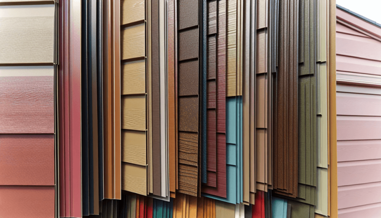
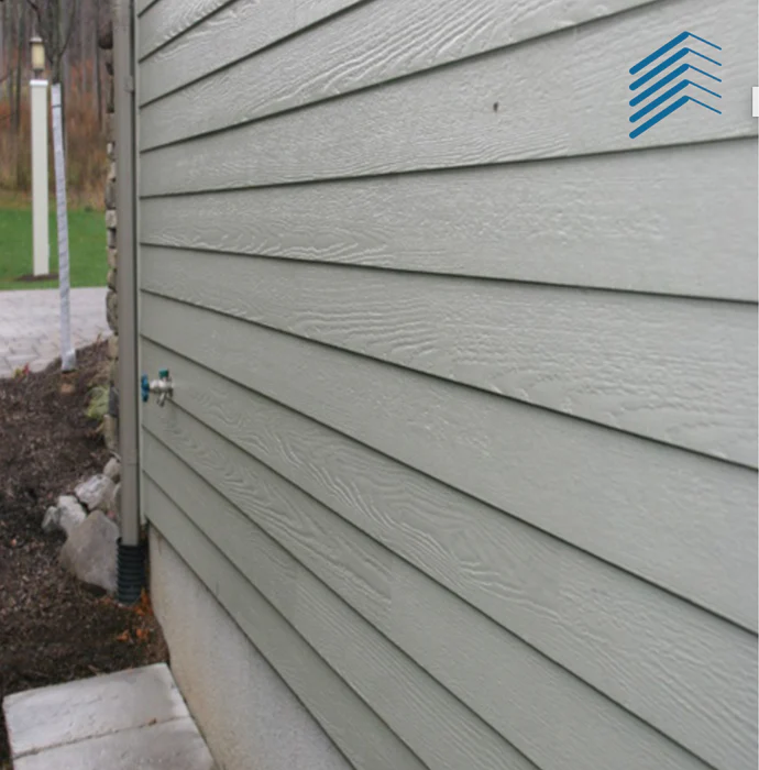
The contemporary market categorizes Vinyl siding color palettes into several distinct families, each serving a specific architectural or geographic purpose. The most common of these is the “Neutral” family, which includes shades of tan, clay, and wheat. These colors are favored for their versatility and their ability to blend seamlessly with natural stone and wood accents. Neutrals are also the safest choice for maintaining long-term resale value across diverse markets.
Another dominant category is the “Cool Toned” palette, which focuses on grays, blues, and slate. These colors have surged in popularity due to the modern preference for “urban” aesthetics even in suburban settings. Grays, in particular, serve as an excellent backdrop for vibrant landscaping, allowing the greens of a lawn or the reds of a flowerbed to pop. Cool tones are often associated with sophistication and modern architectural movements.
Finally, the “Deep and Bold” palette includes colors like espresso, midnight blue, and forest green. These options are designed for homeowners who want to make a statement. They work exceptionally well on larger homes with complex rooflines, as the dark colors help to “anchor” the building to its site. However, these palettes require careful coordination with trim colors to prevent the house from looking overly heavy or gloomy in certain lighting conditions.
Designing for Architectural Integrity
Every home style has a specific set of colors that honor its historical or structural roots. For example, a Craftsman-style home typically looks best when dressed in “earthy” Vinyl siding color palettes. Think of olive greens, deep russets, and warm ochres. These colors emphasize the connection between the home and the natural environment, which is a core tenet of the Craftsman philosophy.
Colonial and Cape Cod styles, on the other hand, benefit from a more traditional approach. Classic whites, light grays, and historical blues are the standard for these symmetrical structures. When applying modern siding to these older styles, the goal is often to mimic the appearance of painted wood lap siding. High-quality vinyl textures that feature deep wood-grain patterns can enhance this illusion, providing the look of cedar without the maintenance requirements.
Modern and Contemporary homes offer more freedom to experiment with non-traditional combinations. You might see a mix of dark vertical siding paired with horizontal wood-look planks. This “mixed-material” aesthetic is highly effective at breaking up large wall surfaces and adding visual interest. In these cases, the palette is used not just for color, but to define different functional zones or architectural features of the building’s facade.
The Impact of Regional Climate on Selection
Geography plays a critical role in how a color palette will perform and appear over time. In the Pacific Northwest, where overcast skies are common, dark or muted colors can sometimes make a house look “flat” or drab. Consequently, many homeowners in this region opt for warmer grays or soft blues that reflect the limited sunlight. Bright whites are also popular here to counteract the gray atmosphere of the rainy season.
In the American Southwest, the intense desert sun dictates a different set of rules. Lighter Vinyl siding color palettes are preferred because they reflect heat rather than absorbing it. Sandy beiges, light terracotta, and creamy whites are not just aesthetic choices; they are functional decisions that can lower interior cooling costs. Furthermore, these colors mimic the natural geology of the region, allowing the home to sit harmoniously within the desert landscape.
Coastal regions also have specific requirements. Salt air and intense coastal light can wash out delicate pastels. Therefore, homeowners in Florida or the Carolinas often choose more vibrant “beachy” colors like seafoam green, coral, or bright sky blue. These colors stand up well to the intense brightness of the coast and fit the casual, vacation-like atmosphere of seaside living. It is essential to consider the “altitude” of the sun at your specific latitude before finalizing a color.
Modern Minimalist Schemes
Minimalism in exterior design is characterized by a “less is more” philosophy, which often translates to monochromatic or highly restricted color schemes. The most popular version of this is the “All-Gray” or “All-White” look. By using varying textures of the same color—such as vertical board and batten siding on one section and horizontal lap siding on another—architects can create depth without introducing secondary colors.
This approach is particularly effective for homes with clean lines and large windows. When the siding is a single, consistent tone, the focus shifts to the shape and proportions of the building itself. However, to keep a minimalist scheme from looking clinical, it is often paired with natural elements like wooden front doors, stone entryways, or heavy landscaping. These organic touches provide the warmth that a monochromatic palette might otherwise lack.
Another trend in minimalism is the use of “Greige”—a hybrid of gray and beige. This color has become a favorite among designers because it bridges the gap between the coolness of gray and the warmth of traditional neutrals. It is an incredibly forgiving color that looks good in almost any light and works well with both silver and bronze hardware finishes. Greige represents the pinnacle of modern, low-risk architectural design.
Traditional and Colonial Combinations
For those who prefer a more historical aesthetic, the “Colonial Palette” remains a gold standard. This typically involves a primary siding color in white or cream, paired with dark shutters and a bold front door. The contrast between the light walls and the dark accents creates a sense of order and formality that is synonymous with American suburban life. This look is timeless and rarely goes out of style, making it an excellent choice for those concerned with long-term trends.
Interestingly, some homeowners are revitalizing these traditional styles by flipping the script. Instead of white siding with dark shutters, they are choosing dark navy or charcoal siding with white trim and shutters. This “inverted” colonial look retains the formal structure of the original architecture but gives it a contemporary edge. It feels fresh and modern while still respecting the traditional roots of the home’s design.
Transition words like “moreover” and “simultaneously” help us understand that these designs are not mutually exclusive. A homeowner can combine traditional proportions with modern Vinyl siding color palettes to create a custom hybrid. The key is to maintain consistency in the trim. Regardless of the siding color, using a single, uniform color for the window casings, soffits, and fascia will tie the entire project together and prevent it from looking cluttered.
Dark Hues and Advanced Pigment Technology
One of the most significant advancements in the industry is the development of heat-reflective technology for dark vinyl siding. In the past, dark colors like black, deep brown, and navy blue would absorb an immense amount of solar energy. This heat would cause the vinyl to expand and contract excessively, leading to “oil canning” or warping. Modern premium siding lines now include “Cool Color” pigments that reflect infrared light.
These pigments allow dark surfaces to stay significantly cooler than traditional dark vinyl. As a result, Vinyl siding color palettes have expanded to include shades that were previously deemed “unsafe” for high-heat environments. This has opened the door for the “Urban Industrial” look, which relies heavily on dark, matte finishes. Homeowners can now enjoy the aesthetic of charred wood or dark metal with the durability and low maintenance of vinyl.
Furthermore, these advanced coatings often include enhanced UV inhibitors. This ensures that the deep, rich color you choose today will look largely the same ten or fifteen years from now. While all colors will experience some degree of shifting over decades, the rate of change in modern premium siding is negligible compared to the products of the 1980s. This durability makes the investment in a dark, bold palette much more viable for the average homeowner.
| Palette Category | Popular Shades | Best Architectural Match | Climate Suitability |
|---|---|---|---|
| Earthy Neutrals | Clay, Sand, Wheat | Craftsman, Ranch, Rustic | Universal / Sunny Regions |
| Cool Tones | Slate, Pewter, Sterling | Modern, Industrial, Transitional | Northern / Overcast Regions |
| Deep & Saturated | Navy, Forest, Espresso | Victorian, Farmhouse, Estate | Temperate / Shaded Areas |
| Coastal Brights | Seafoam, Sky, Pearl | Cottage, Seaside, Bungalow | High-Light / Coastal Zones |
Balancing Primary Tones with Trim and Accents
The secret to a professional-looking exterior lies in the ratio of colors used. Professional designers often follow the “60-30-10” rule. Under this guideline, 60% of the home’s visible surface (the siding) is the primary color. 30% of the surface (the trim, garage doors, and windows) is the secondary color. The final 10% (the front door, shutters, or decorative accents) is a bold, “pop” color that adds character.
When choosing from various Vinyl siding color palettes, you must also consider the color of your roof. Since the roof is a permanent and expensive feature, it acts as the “anchor” for your palette. If you have a gray shingle roof, you should stay within the cool or neutral families. If you have a brown or “weathered wood” roof, warmer tones will generally look more harmonious. Forcing a cool gray siding onto a house with a warm brown roof can create a visual “clash” that feels unsettled.
Additionally, don’t forget the impact of stonework or brick. Many modern homes use a “wainscoting” effect where the bottom third of the house is stone and the top two-thirds is vinyl. In this scenario, the siding color should pull from one of the “mid-tones” found in the stone. By matching the vinyl to a subtle fleck of color in the masonry, you create a cohesive look that appears as though the materials were designed to be together from the beginning.
Texture and Grain: Beyond the Flat Surface
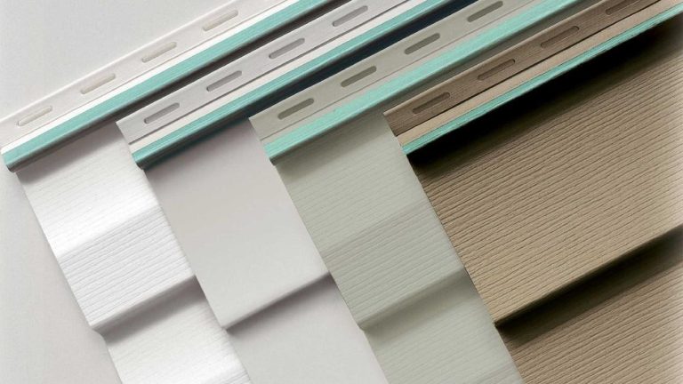
While color is the primary focus, the texture of the vinyl siding significantly alters how that color is perceived. A smooth, matte finish will make a color look more modern and “clean.” Conversely, a deep wood-grain texture will catch the light at different angles, creating micro-shadows that make the color appear darker and more varied. This mimicry of natural wood adds a layer of authenticity to Vinyl siding color palettes.
Vertical siding, often called “Board and Batten,” is another way to manipulate color perception. Because the “battens” create strong vertical shadows, they make the siding color look more dynamic throughout the day. This style is currently exploding in popularity for “Modern Farmhouse” designs, where it is typically paired with stark whites or deep charcoals. The shadow lines provide the visual “break” necessary to prevent a large white wall from looking like a flat sheet of plastic.
There are also “shingle” and “shake” vinyl options that replicate the look of cedar. These are often used as accent pieces in gables or on the front of the house to add texture. When used with a slightly different shade from the main siding—perhaps a “tonal” match that is one shade darker—shingles can create a sophisticated, high-end look. This layering of texture and color is what separates a basic siding job from a custom architectural renovation.
Energy Efficiency and Thermal Absorption
It is a common misconception that siding is purely decorative. In reality, your choice of Vinyl siding color palettes can impact your home’s thermal performance. Lighter colors have a higher Solar Reflectance Index (SRI), meaning they bounce a larger percentage of the sun’s energy away from the home. This can be a significant advantage in southern climates, where reducing the “heat gain” on the walls can lead to lower air conditioning bills.
However, darker colors are not necessarily a liability in the modern era. Many premium vinyl manufacturers now offer “insulated siding,” which features a layer of rigid foam backing. This insulation provides an “R-value” that helps stabilize the interior temperature of the home regardless of the exterior color. If you are determined to use a dark, trendy color like “Iron Gray” or “Midnight Blue,” investing in the insulated version is a smart move for both structural stability and energy efficiency.
Furthermore, the thermal mass of the wall assembly should be considered. In colder northern climates, a darker siding color can actually provide a slight “passive solar” benefit during the winter by absorbing heat. While this effect is modest compared to proper attic insulation, it is another layer in the complex relationship between aesthetics and physics. Every choice you make for your home’s exterior has a ripple effect on its overall performance.
The Role of Light: Diurnal and Seasonal Variations
One of the most frequent mistakes homeowners make is choosing a color based on a small swatch viewed indoors under fluorescent lighting. Color is a byproduct of light, and the quality of light changes constantly. A light gray that looks perfect in a showroom might look like a stark, cold blue under a clear morning sky. Similarly, a warm beige might turn “muddy” during a golden-hour sunset.
To avoid “color shock,” it is vital to view Vinyl siding color palettes in the context of your specific property. Observe how the samples look at 8:00 AM, noon, and 6:00 PM. You should also look at them on both the north and south sides of your house. Because the north side receives mostly indirect, blue-toned light, colors will appear cooler and darker there. The south side receives direct, warm sunlight, which can make colors appear brighter and more washed out.
Seasonal changes also play a role. If you live in an area with deciduous trees, your home will be surrounded by vibrant greens in the summer, fiery oranges in the fall, and stark grays in the winter. Your chosen palette needs to work across all these backdrops. A bright green siding might look great in the summer but could feel overwhelming when the leaves are gone. Neutral and “stony” colors tend to be the most resilient across seasonal shifts.
Navigating Homeowners Association Restrictions
Before you fall in love with a specific color scheme, you must consult your Homeowners Association (HOA) or local historical society. Many planned communities have strict guidelines regarding Vinyl siding color palettes to maintain a cohesive neighborhood “vibe.” These rules are often designed to prevent any one house from standing out too aggressively, which could theoretically impact the property values of neighbors.
Some HOAs provide a “pre-approved” list of colors from specific manufacturers. Others may allow any color as long as it falls within a certain “LRV” (Light Reflectance Value) range. If you want to deviate from the standard tan or beige, you may need to submit a formal proposal including samples of the siding, trim, and roofing materials. Proving that your chosen palette is “architecturally appropriate” for the style of the house is often the key to winning approval.
However, don’t view HOA rules as a purely negative constraint. These guidelines often prevent “color clashes” between adjacent houses. For example, you wouldn’t want to paint your house a bright “Robin’s Egg Blue” if your immediate neighbor has a “Harvest Gold” home. The goal of an HOA is to ensure that the collective aesthetic of the street remains harmonious, which ultimately protects your investment as much as theirs.
Resale Value and Market Neutrality
While your home is a place for personal expression, it is also likely your largest financial asset. Therefore, considering “resale value” is a pragmatic necessity when exploring Vinyl siding color palettes. Real estate data consistently shows that neutral, “safe” colors tend to attract the widest pool of buyers. High-contrast “Modern Farmhouse” palettes (White siding/Black trim) are currently at the top of the list for buyer preference.
However, “market neutrality” doesn’t have to mean “boring.” You can use “near-neutrals” like sage green, navy blue, or slate gray to add personality without alienating potential buyers. These colors are popular enough to be considered “current” but grounded enough not to be polarizing. The goal is to make the buyer feel that the house is modern and well-cared-for, rather than a “project” that will require immediate repainting or re-siding.
Interestingly, the “safest” color isn’t always white. In some markets, white can be seen as high-maintenance or too “plain.” A soft “Greige” or a light “Pebble” tone often feels more premium to a buyer than a standard builder-grade white. When in doubt, look at the newest high-end developments in your area. Developers spend thousands on market research to determine which Vinyl siding color palettes are currently most appealing to buyers with high purchasing power.
Earth-Tone Integration for Rural Properties
For homes situated on large, wooded lots or rural acreages, the design goal is often “integration” rather than “contrast.” In these settings, Vinyl siding color palettes that mimic the natural environment are the most successful. Deep olives, dark browns, and “clay” tones allow the home to recede into the landscape, making the architecture feel like a natural extension of the earth.
This “organic” approach is enhanced by using textures like vinyl cedar shakes. When these shakes are produced in multi-tonal “weathered” colors, they are indistinguishable from real wood from a distance. This is a popular choice for lake houses, mountain cabins, and forest retreats. It provides the rustic charm that these settings demand without the constant battle against wood rot, woodpeckers, and insects that comes with real timber siding.
Moreover, rural homes often deal with more “environmental staining” from pollen, dust, and mud. Earth tones are incredibly practical in this regard, as they hide “natural wear” much better than a bright white or a dark black. A “khaki” or “stone” colored home can look clean for months, whereas a white home might show every splash of mud from a spring rainstorm. In the country, practicality and aesthetics go hand-in-hand.
Coastal Vibrancy: Blues, Grays, and Pastels
The rules of color change when you move toward the ocean. Coastal light is “brighter” because it reflects off the water and white sand. This allows for Vinyl siding color palettes that might feel too garish in a landlocked suburb. Soft aquas, pale yellows, and even light lavender can look stunning against a backdrop of blue water and green palms. These colors reflect the breezy, lighthearted nature of coastal life.
However, the most popular coastal palette remains the “Navy and White” combination. This nautical theme is timeless and provides a crisp, clean look that stands up well to the intense sun. When using navy siding, it is crucial to use high-quality, UV-resistant vinyl to prevent the blue from turning into a dull purple over time. Pairing this with “Extra White” trim and silver-toned hardware completes the classic maritime aesthetic.
Grays are also a staple of coastal design, but they are usually “Warm Grays” or “Driftwood” tones. These mimic the look of cedar siding that has been naturally weathered by salt air. This “Cape Cod” look is highly sought after because it feels historic and established. By using vinyl versions of these weathered tones, homeowners can achieve the “shabby chic” coastal look without the structural vulnerability of salt-damaged wood.
Maintenance Realities of High-Pigment Siding
While vinyl is “low maintenance,” it is not “no maintenance.” Regardless of the Vinyl siding color palettes you choose, the surface will eventually accumulate a layer of oxidation and environmental “biofilm” (dust, pollen, and mold spores). This layer can make colors look dull or “chalky.” On lighter colors, this is less noticeable, but on dark colors like espresso or charcoal, it can be quite apparent.
The good news is that cleaning vinyl is remarkably simple. A yearly power wash (on a low-pressure setting) or a scrubbing with a soft-bristle brush and a mild detergent is usually all that is required to restore the color’s original luster. Avoid using harsh chemicals or abrasive cleaners, as these can scratch the surface of the vinyl and create “micro-grooves” where dirt can settle more deeply. Keeping the siding clean also extends the life of the UV-resistant topcoat.
It is also important to note that you should never paint over vinyl siding unless you use a paint specifically formulated for it. Standard exterior paints can trap heat, causing the vinyl to buckle. Furthermore, if you choose a paint color darker than the original siding, the heat absorption can exceed the vinyl’s structural limits. If you are unhappy with your current palette, the most effective long-term solution is almost always a full replacement with a factory-colored product.
Visualizing the Transformation: Samples and Software
In the digital age, homeowners no longer have to guess what their house will look like. Most major siding manufacturers offer online “visualizers.” You can upload a photo of your actual home and “digitally paint” it with different Vinyl siding color palettes. These tools are incredibly helpful for seeing how a specific color interacts with your roofline, windows, and existing stone or brickwork.
However, digital tools have limitations. Screen calibrations vary, and a color that looks “Sage Green” on your iPhone might look “Olive Drab” in person. Therefore, the final step should always be ordering large physical samples. Most reputable contractors can provide 2-foot sections of the actual siding. Lean these against your house and leave them there for a few days. Seeing the physical material in the actual light of your property is the only way to be 100% sure of your choice.
Don’t be afraid to ask for “referral addresses” from your contractor. Often, they can point you to a house they recently completed in the exact color you are considering. Driving by a finished project allows you to see the color on a “macro” scale, covering thousands of square feet. This is the ultimate “litmus test” for any palette. If you love how a color looks on a whole house down the street, you will likely love it on yours as well.
Conclusion: Future-Proofing Your Home’s Identity
Choosing between different Vinyl siding color palettes is a balancing act between personal taste, architectural tradition, and environmental reality. By moving beyond the “safe” beige options of the past and embracing the technologically advanced hues of the present, you can transform a standard house into a standout home. Whether you choose the moody sophistication of “Iron Ore” or the timeless purity of “Arctic White,” your exterior is the first chapter of your home’s story.
Ultimately, the best palette is one that makes you happy every time you pull into your driveway. While resale value and HOA rules are important, your home is your sanctuary. By doing the research, viewing samples in different lights, and considering the “thermal footprint” of your choices, you can ensure that your siding replacement is a success. The right color won’t just protect your walls; it will elevate your lifestyle and provide a sense of pride for years to come.